



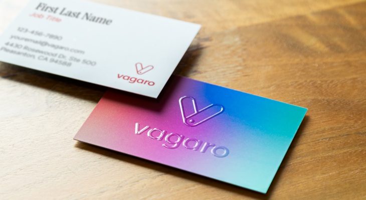
A business card is small, but it carries a lot of weight. Before anyone reads your title, scans your QR code, or visits your website, they feel the card in their hand. That first tactile impression can suggest confidence, creativity, attention to detail, or, unfortunately, the opposite. Choosing the best card stock for business cards means balancing thickness, finish, durability, print quality, and brand personality.
TLDR: For most business cards, a thickness between 14 pt and 18 pt offers a professional feel without becoming bulky. Matte finishes are elegant and easy to write on, while gloss finishes make colors pop. For a premium impression, consider 32 pt card stock, soft touch coating, textured paper, or specialty finishes such as foil stamping or painted edges.
Why Card Stock Matters
Card stock is more than simply “thick paper.” It affects how your business card looks, feels, prints, bends, and ages. A flimsy card may suggest a rushed or budget-conscious brand, while a sturdy, well-finished card can communicate professionalism before a word is spoken.
The right choice depends on your industry, audience, design style, and how the card will be used. A minimalist consultant may prefer a crisp matte card with subtle texture. A photographer might choose glossy stock to showcase vivid imagery. A luxury brand could benefit from ultra-thick stock, foil, or embossed details.
Understanding Business Card Thickness
Business card thickness is often measured in points, abbreviated as pt. One point equals one-thousandth of an inch, so a 16 pt card is 0.016 inches thick. In general, the higher the number, the thicker and more rigid the card.
- 10 pt to 12 pt: Lightweight and economical, but often too thin for a polished professional impression.
- 14 pt: A common standard for business cards. It feels sturdy enough for everyday networking and is usually affordable.
- 16 pt: A popular premium choice. It has noticeable weight and feels more substantial than basic cards.
- 18 pt to 24 pt: Thick, durable, and impressive. Ideal for brands that want a more upscale tactile experience.
- 32 pt and above: Ultra-thick stock, sometimes created by layering paper. Excellent for luxury cards, creative professionals, and memorable leave-behinds.
For most businesses, 16 pt card stock is the sweet spot. It offers a confident feel without being overly expensive or difficult to store. If your card is part of a high-end brand experience, however, upgrading to 18 pt, 24 pt, or even 32 pt can make a strong impact.
Matte, Gloss, and Uncoated Finishes
The finish of your card determines its surface texture and how it reflects light. It also affects readability, color vibrancy, and whether people can write notes on the card.
Matte Finish
Matte card stock has a smooth, non-shiny surface. It gives business cards a refined and modern appearance, making it a favorite for consultants, designers, wellness brands, real estate professionals, and corporate teams.
Matte finishes are excellent for text-heavy cards because they reduce glare and improve readability. They also work well with minimalist layouts, muted colors, and elegant typography. A standard matte coating may be somewhat writable, though an uncoated matte stock is better if you want recipients to easily jot down notes.
Gloss Finish
Glossy card stock has a shiny coating that reflects light and enhances color intensity. It is a good choice for designs with photos, vivid graphics, product images, or bold color palettes.
Gloss can make a card feel energetic and eye-catching, but it has drawbacks. Fingerprints may show more easily, glare can reduce readability under bright light, and writing on the surface is difficult. If your design includes small text or a subtle logo, gloss may be too reflective.
Uncoated Finish
Uncoated card stock has a natural paper feel. It is easy to write on, absorbs ink well, and often feels warmer or more organic than coated paper. This finish is popular for handmade brands, stationery companies, therapists, photographers, cafés, and environmentally conscious businesses.
Because uncoated paper absorbs more ink, colors may appear softer than they would on coated stock. That is not necessarily a disadvantage; for many brands, the understated look is exactly the point.
Specialty Finishes That Add Impact
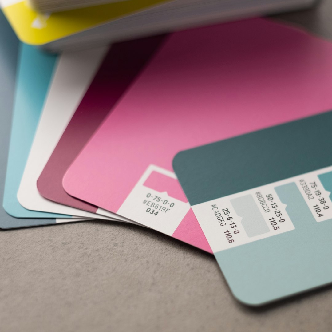
If you want your business card to stand out, specialty finishes can add a memorable visual and tactile detail. These options usually cost more, but they can be worthwhile if your card needs to feel distinctive.
- Soft touch coating: A velvety, smooth finish that feels luxurious and modern. It pairs beautifully with minimalist designs.
- Foil stamping: Metallic foil in gold, silver, copper, or custom colors. Great for logos, names, borders, or premium accents.
- Spot UV: A glossy coating applied to specific areas, creating contrast against a matte background.
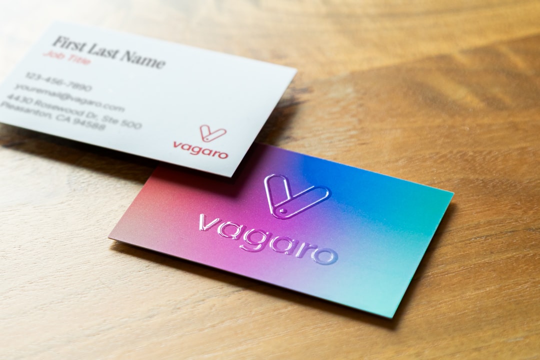
- Embossing and debossing: Raised or pressed details that add dimension and texture.
- Painted edges: Color applied to the edges of thick cards, creating a bold side profile.
- Textured paper: Linen, cotton, laid, or felt textures that create a tactile, artisanal quality.
Use specialty finishes strategically. A business card with foil, embossing, spot UV, and painted edges can become visually overloaded. The best premium cards often use one or two standout effects with restraint.
Choosing Card Stock by Brand Type
Your business card should feel aligned with your brand. The “best” stock is not always the thickest or most expensive; it is the one that supports your message.
- Corporate and professional services: Choose 16 pt matte or 18 pt smooth stock. Keep the look clean, readable, and polished.
- Creative professionals: Consider 18 pt or thicker stock, texture, spot UV, or an unusual finish that reflects your style.
- Luxury brands: Use 24 pt to 32 pt stock, soft touch coating, foil stamping, embossing, or painted edges.
- Retail and hospitality: Gloss or silk finishes can work well, especially when using product photos or vibrant brand colors.
- Eco-conscious brands: Recycled, kraft, cotton, or uncoated paper can reinforce sustainability and authenticity.
Print Quality and Design Considerations
Even excellent card stock cannot save a poorly prepared design. To get the best result, make sure your artwork is set up properly for printing. Use high-resolution images, keep text clean and legible, and allow proper bleed around the edges.
Dark backgrounds, tiny fonts, and thin lines require extra care. On textured or uncoated stock, fine details may not print as sharply as they would on smooth coated paper. On glossy stock, large areas of dark ink may show fingerprints more easily. If your card includes a QR code, test it at the final printed size before ordering a full batch.

Durability and Practical Use
Business cards often end up in wallets, pockets, card holders, event bags, or desk drawers. A durable card resists bending, fraying, and general wear. Thicker stock usually performs better, but finish also matters.
Laminated, soft touch, silk, or coated cards tend to resist moisture and scuffing better than uncoated cards. However, uncoated cards are easier to write on and can feel more personal. If you frequently write appointment times, discount codes, or direct phone numbers on your cards, avoid heavy gloss coatings.
So, What Is the Best Card Stock?
For a dependable, professional business card, start with 16 pt matte card stock. It is thick enough to feel credible, versatile enough for most designs, and refined without being flashy. If your brand depends on strong visual impact, consider gloss, silk, or spot UV. If touch and elegance matter most, explore soft touch, textured paper, or thicker stock.
For premium cards, 18 pt to 32 pt stock offers a more memorable hand feel. Pair it with a restrained specialty finish, such as subtle foil or embossed lettering, for a card that feels intentional rather than excessive.
Final Thoughts
The best business card stock is the one that makes your brand feel credible, memorable, and appropriate to your audience. Thickness creates the first physical impression, finish shapes the visual experience, and paper quality determines how the card holds up over time.
When in doubt, order samples before committing. Hold different stocks, compare finishes under natural light, and imagine handing each one to a potential client. A well-chosen card does not just share contact details; it quietly tells people what kind of business you are.