Search bars are often treated as simple UI components, yet they play a crucial role in how quickly and comfortably users find what they are looking for. In UX design, a well-crafted search bar can act as a shortcut through complex content structures, transforming frustration into flow. As digital products grow in size and complexity, the search experience increasingly becomes the main driver of efficient navigation.
TLDR: A great UX design search bar helps users navigate faster by being visible, intuitive, and forgiving of errors. Best practices include clear placement, smart autocomplete, helpful results formatting, and accessibility-first design. When optimized thoughtfully, search becomes a primary navigation tool, not just a backup option.
Why the Search Bar Matters in UX Design
Users come to digital products with different intentions. Some are explorers, happy to browse menus and categories, while others are hunters, determined to find a specific item as quickly as possible. For these goal-driven users, the search bar is the most efficient path forward.
A poorly designed search experience forces users to slow down, rethink their queries, or even abandon the product altogether. On the other hand, an effective search bar reduces cognitive load, shortens task completion time, and increases overall satisfaction. In e-commerce, this can mean higher conversion rates. In enterprise or content-heavy platforms, it can translate to productivity gains.

Strategic Placement for Maximum Visibility
One of the most fundamental best practices is making the search bar easy to find. Users should not have to hunt for the tool that helps them find everything else.
- Top-center or top-right placement: These are the most expected locations on desktop interfaces.
- Sticky search bars: Keeping the search visible while scrolling can significantly reduce friction.
- Prominent mobile access: On mobile, search is often placed at the top or represented by a clearly recognizable icon.
Consistency is key. Changing the position of the search bar across pages or layouts can confuse users and break their mental model of the interface.
Designing for Clarity and Affordance
A search bar should look instantly recognizable as a place where text can be entered. Subtle or overly stylized designs might look elegant, but they often sacrifice usability.
- Clear input field: A visible border or background contrast helps define the search area.
- Descriptive placeholder text: Use helpful examples like “Search products, articles, or help” rather than generic labels.
- Recognizable icons: The magnifying glass remains a universal symbol for search.
These visual cues reduce hesitation and encourage users to interact with the search feature immediately.
Speed Through Smart Autocomplete and Suggestions
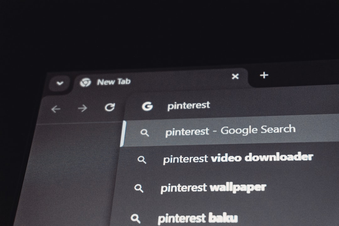
Autocomplete and suggestion features dramatically improve search efficiency. By predicting user intent, they reduce typing effort and guide users toward successful queries.
Effective autocomplete systems typically provide:
- Query suggestions: Completing or refining what the user is typing.
- Popular searches: Highlighting commonly used terms.
- Instant results previews: Showing matching items before the user submits the search.

These features not only speed up navigation but also educate users about the content available, often revealing options they did not initially consider.
Error Tolerance and Flexible Input
Humans make mistakes, and a good UX search bar anticipates that reality. Rigid search systems that require perfect spelling or exact phrases quickly lead to frustration.
Best practices for error tolerance include:
- Typo correction: Automatically handling misspellings and minor errors.
- Synonym recognition: Understanding that different words can mean the same thing.
- Natural language processing: Allowing users to type conversational queries.
When users feel that the system “understands” them, trust increases and navigation becomes more fluid.
Useful and Scannable Search Results
Finding results is only half the job; presenting them effectively is equally important. Users often decide within seconds whether the results match their intent.
Well-designed search results pages share several qualities:
- Clear hierarchy: Titles, metadata, and descriptions should be easy to scan.
- Highlighted keywords: Emphasizing matched terms helps users understand relevance.
- Filters and sorting: Allowing users to refine results by category, date, price, or relevance.
When results feel overwhelming or irrelevant, even the best search algorithm can feel ineffective from a UX perspective.
Accessibility as a Core Requirement
Accessibility should never be an afterthought, especially for a core navigation component like search. Inclusive design ensures that all users, regardless of ability, can benefit from faster navigation.
- Keyboard accessibility: Users should be able to focus, type, and submit searches without a mouse.
- Screen reader support: Labels and ARIA attributes should clearly describe the search field.
- Sufficient contrast: Text and icons must be readable for users with visual impairments.
Designing accessibly often improves usability for everyone, not just users with disabilities.
Context-Aware and Personalized Search
Modern search experiences increasingly adapt to users and context. Personalization can significantly reduce navigation time when implemented responsibly.
Examples include:
- Recently searched items: Allowing users to quickly revisit past queries.
- Role-based results: Tailoring content in enterprise tools based on user permissions.
- Location or behavior awareness: Adjusting suggestions based on current context.
The key is balance. Over-personalization can feel intrusive or confusing, so transparency and control are essential.
Measuring and Improving Search UX
No search bar design is ever truly finished. Continuous measurement helps teams identify friction points and opportunities for improvement.
- Search success rate: How often users find relevant results.
- Time to result: How long it takes users to reach desired content.
- Zero-result searches: Queries that return nothing and signal gaps in content or logic.
Combining quantitative data with qualitative feedback, such as usability testing, provides the clearest insight into how real users experience search.
Conclusion: Turning Search Into a Navigation Superpower
A thoughtfully designed UX search bar is more than a functional necessity; it is a strategic tool for faster and more satisfying user navigation. By focusing on visibility, clarity, intelligence, accessibility, and continuous improvement, designers can transform search from a last resort into a primary interaction path.
In an age where users expect instant answers, investing in search bar best practices is not optional. It is one of the most impactful ways to respect users’ time, reduce friction, and create digital experiences that feel intuitive from the first keystroke.


