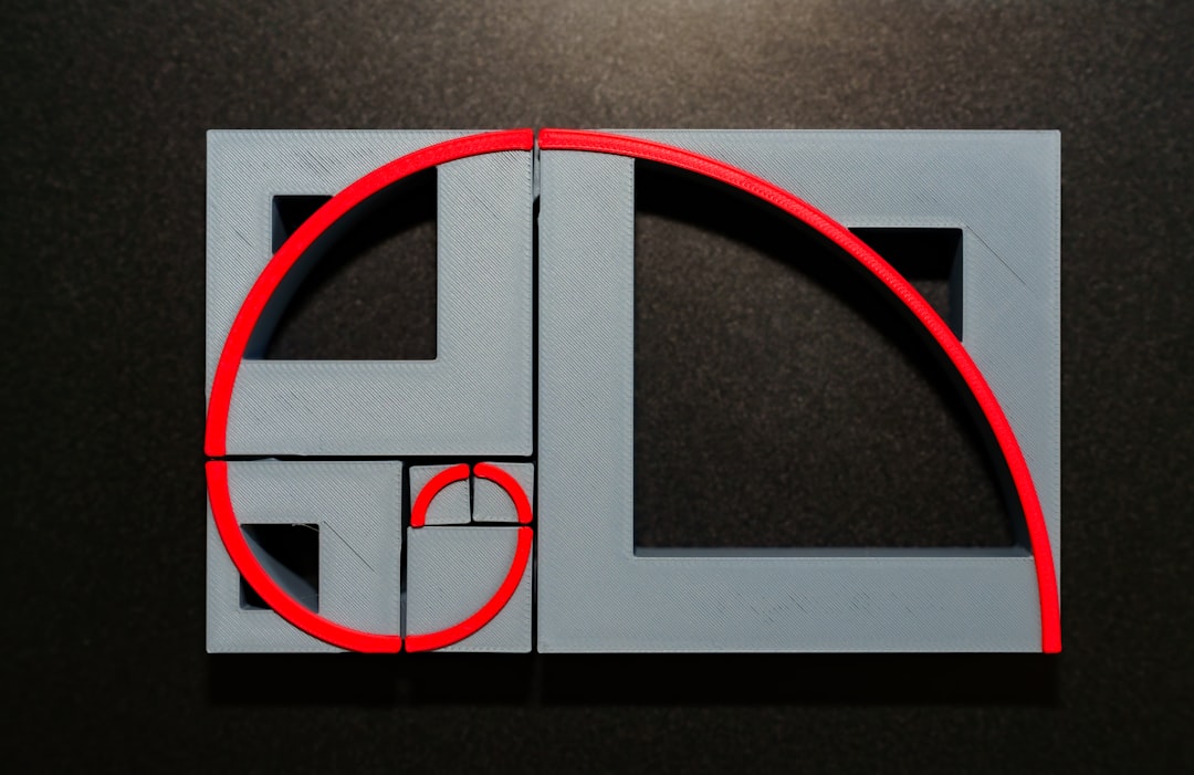
In the realm of branding, the smallest design choices can make or break the perception of a company. One of the most overlooked yet critical elements is logo alignment and composition. When logo elements are misaligned — whether it’s text placement, icon spacing, or proportions within the logo frame — the resulting design can seem chaotic, amateurish, and untrustworthy. Fortunately, employing a structured approach like the Grid + Alignment Method can transform a disorganized logo into a symbol of professionalism and visual harmony.
TLDR
When a logo’s elements are misaligned, the design looks inconsistent and lacks professionalism, undermining brand credibility. Using the Grid + Alignment Method brings order, balance, and structure, making the logo instantly more polished and cohesive. This method relies on invisible guides, consistent spacing, and geometric harmony to build a better brand image. The transformation can often be subtle but results in a noticeably cleaner and more trustworthy appearance.
The Consequences of Misaligned Logo Elements
Few things can appear more off-putting to a consumer or client than a badly composed logo. While the casual observer may not consciously notice every misalignment, the subconscious effect is powerful. It sends subtle messages of disorder and inattentiveness, two characteristics that can be disastrous for any brand.
Among the most common alignment issues in logos:
- Improper spacing: Letters or icons that sit too close or too far apart create tonal confusion.
- Asymmetric layouts: Elements placed without alignment throw off visual balance.
- Inconsistent proportions: When elements don’t scale appropriately, the logo loses harmony.
To illustrate, consider a fictional tech company “Neurox.” Their original logo included an abstract neural icon placed beside the wordmark. The problem? The icon sat slightly higher than the text, and the spacing between letters varied slightly. While these may appear like small issues, the culmination created a sense of sloppiness. 
Diagnosing the Problem with a Design Audit
Fixing a misaligned logo begins with a comprehensive design audit. This involves stepping back and analyzing whether each visual component serves the composition well. For “Neurox,” a quick design breakdown revealed:
- The icon didn’t line up vertically with the letterforms
- The kerning between characters “e” and “u” was too tight
- The bottom of the icon didn’t correspond geometrically with the cap height of the typeface
On its own, none of these problems severely cripple a logo. But together, they give off the impression of something unfinished — or worse — unprofessional.
Introducing the Grid + Alignment Method
The Grid + Alignment Method is a structured way to compose logos and unify all elements under a consistent system. It’s widely used by professional designers and major branding agencies who know that precision transforms aesthetics.
Here’s how it works:
- Create a grid: Start with a baseline grid made of horizontal and vertical guides. These serve as the scaffolding for alignment.
- Place main elements: Fit text and icons into the grid zones. Ensure symmetries are respected.
- Check spacing with rhythm guides: Use equal spacing units across different parts of the logo. This adds harmony.
- Align with invisible shapes: Draw invisible geometric shapes like squares or circles around elements to check balance and proportion.
When “Neurox” applied this method, they discovered that aligning their icon and text with horizontal grid-lines corrected the unevenness. Additional vertical guides ensured that the space between the logo mark and the wordmark maintained visual tension but felt intentional rather than arbitrary.
The Transformative Power of Alignment
Once the Grid + Alignment Method was applied to the “Neurox” logo, the transformation was clear. The visual harmony made the brand instantly feel more legitimate. Stakeholders — including investors and early customers — noted the new feel of confidence and refinement in the logo.
What made the difference wasn’t a new icon or font but the coordination between them. An aligned logo performs better across mediums too — it scales better for digital use, looks cleaner in print, and fits better into app icons or social media avatars.
Even common spacing tricks made an impact. For example, matching the padding around the logo icon to the x-height of the typography created a proportional boundary that made the logo feel self-contained and complete.
Why Grid-Based Design is Timeless
Design trends change rapidly, but grid-based symmetry and alignment never go out of style. From Swiss graphic design to contemporary UI layouts, the grid system ensures clarity, rhythm, and predictability — all critical qualities for brand consistency.
Consider iconic logos like Apple or IBM. Their designs are mathematically structured and aligned perfectly. It’s what makes them memorable and universally adaptable. Grid systems also future-proof logos for scaling, animation, and responsive layouts, making it easier to expand brand systems over time.
Common Mistakes to Avoid
Here are some frequent alignment errors and simple fixes:
- Ignoring optical adjustments: Not all shapes appear centered even when they mathematically are. Use optical alignment for balance.
- Lack of vertical rhythm: Spacing between stacked elements should flow as if following a musical beat.
- Random spacing values: Always use consistent measurement units—margin of 8px, multiples of 4px, etc.
Conclusion
The difference between a forgettable logo and a timeless brand mark often comes down to alignment. Misaligned logos signal inexperience, while aligned compositions radiate professionalism. The Grid + Alignment Method is more than just a technical guide—it’s a design philosophy rooted in balance, clarity, and precision. By implementing this approach, brands not only fix their visuals but also elevate their overall credibility.
Frequently Asked Questions
Why does alignment matter in a logo?
Proper alignment ensures balance and professionalism. Misalignment can create visual tension and make the design look careless, which negatively affects brand perception.
What is the Grid + Alignment Method?
It’s a structured design approach where visual elements are placed using horizontal and vertical grids, consistent spacing, and geometric proportion rules to achieve harmony and professionalism in brand design.
Can a minor misalignment affect brand trust?
Yes. Even small inconsistencies can trigger subconscious doubt about a brand’s reliability, especially when seen by design-conscious users or in professional settings.
How do I know if my logo is misaligned?
Evaluate it using grid overlays, check for equal spacing, and ensure alignment between visual elements and text baselines. Design audits or consultation with a graphic designer can also identify issues.
Is it possible to fix alignment without redesigning the logo?
Often, yes. Adjusting spacing, positioning, and applying a grid system can resolve most alignment issues without changing the overall logo concept.


