
")


Want your flyer to *pop*? To grab eyes on a crowded bulletin board or stand out in a social media scroll-fest? Designing a flyer that outshines the rest isn’t rocket science. It just needs a little creativity, some simple tricks, and a splash of fun. Let’s dive into how you can make your flyer dazzle!
1. Start with a bold headline
Your headline is the hook. It’s what makes people stop and look. So make it loud and clear. Use bold fonts. Ask a funny question or make a striking statement.
- “Free Pizza Friday!” – Who wouldn’t want to read more?
- “Dance Like Nobody’s Watching – Except Everyone Will Be!”
- “Lost: Unicorn with Superpowers” – Instant attention grabber.
Be creative. Be quirky. Be unforgettable!
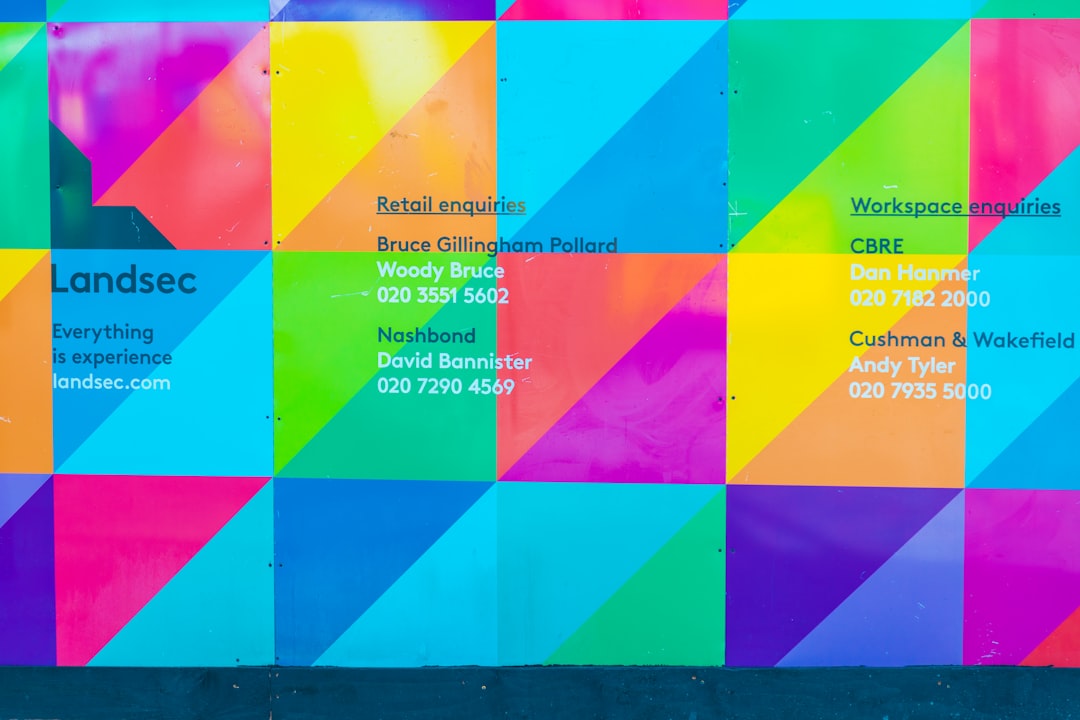
2. Use eye-catching colors
Color is your secret weapon. Think neon pink, electric blue, or fire truck red. Use color contrasts to help your text pop. But don’t go overboard! Too many colors can cause chaos.
- Pick 2-3 main colors that pop but don’t clash.
- Use white space to let your design breathe.
- Make sure your text stands out against the background.
3. Use fun, readable fonts
Fonts can make or break your flyer. Go for bold and legible.
- Use one funky font for headlines.
- Stick to simple fonts like Arial or Open Sans for the details.
- Avoid using more than 2 different fonts — this keeps it clean.
And don’t forget about size! Your headline should shout. Your details should whisper… nicely.
4. Include an image or illustration
A picture is worth a thousand flyers. The right image can make your design pop and explain your message at a glance.

Not sure what to use? Try one of these:
- A photo of your product
- People having fun at your event
- A cool cartoon or playful icon
Just make sure it works with your colors and layout!
5. Keep the message short and sweet
Don’t overload your flyer with words. People aren’t going to read an essay on a poster pole.
- Headline, key info, call to action – That’s all you need.
- Use bullet points to break it up (like we’re doing now!)
- Less text = more impact.
6. Add a call to action
Tell people exactly what you want them to do. It can be simple:
- “Call now!”
- “Visit our website”
- “Come party with us on Saturday!”
- “Tag us on social with #FlyerFun”
Make it clear. Make it exciting!
7. Use shapes and layout like a pro
Boxes, circles, arrows — oh my! Shapes can guide your reader’s eyes where you want them to go. Good layout makes your flyer easy to follow and keeps it looking fresh.
- Put the headline at the top
- Image in the middle or side
- Contact info and call to action at the bottom
Think of your flyer like a story — guide people through it smoothly.
8. Print it right (or post it right!)
If it’s for print, use high-quality paper. A beautiful design on cheap, flimsy paper doesn’t stand tall. If it’s digital, make sure it looks awesome on phones and desktops.
Save it in the right size and resolution. Blurry images are a no-go!
Time to stand out!
Your flyer deserves to shine. So remember: Be bold. Be bright. Be brief. Add a splash of personality and a sprinkle of strategy, and your flyer will be the one everyone’s talking about!
Now go make something amazing! 🎨✨


 Error 307 Fix")